Analyses flow – step 2: Mapped coordinates of fixations on the two Pollock paintings are displayed as heat maps which reflect the density at given locations of a given painting in pseudo-colour code (green>yellow>red for low>large density). This can be done for individual participants and pooled participant data (shown here).
 Heat Map for ‘Mural’: whilst there is considerable variation of individual heat maps (not shown here), the pooled fixation density from 24 participants (120 minutes of recording: 17,098 fixations) shows a wide coverage of most regions of the painting, with some distinct regions that are preferentially looked at (red hotspots).

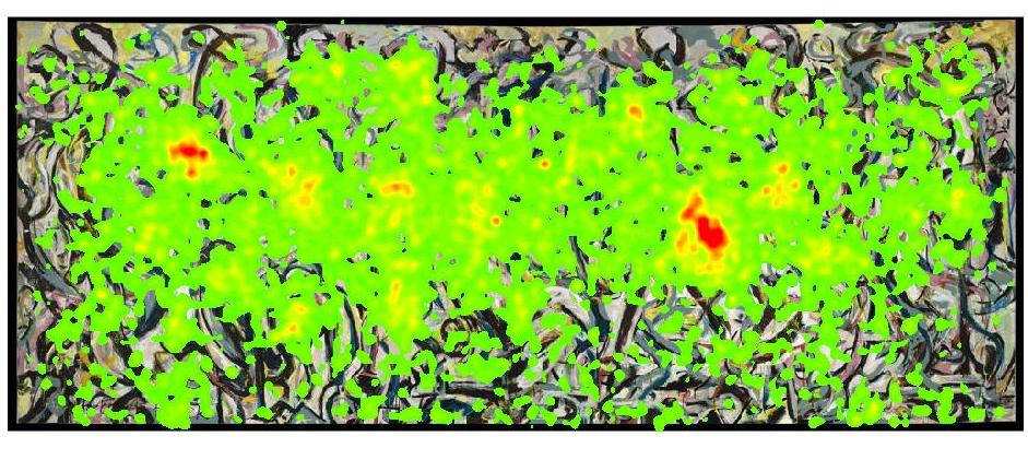
Heat Map for ‘Blue Poles’: whilst there is considerable variation of individual heat maps (not shown here), the pooled fixation density from 24 participants (24 participants, 109 minutes of recording: 19,498 fixations) shows a wide coverage of most regions of the painting, with some distinct regions that are preferentially looked at (red hotspots). Note: the most prominent hot spot in the central area is not located on the exactly centre of the painting.
Cheese maps offer an alternative approach to visualise key areas of interest by showing high density of fixation in high contrast of the painting within a yellow background area corresponding regions that were not fixated (as if each fixation is burning a little hole into a slice of cheese). This represents to mental representation of the painting acquired during the inspection of the corresponding painting of an individual observer, or of the pooled representation of a group of observers, revealing hotspots in the painting for individual or groups of observers. Cheese Map for ‘Mural’: pooled fixation density from all 24 participants (left) make the regions of the painting visible, which are preferentially looked at (hotspots) on average by all observers, and for two individual observers (right). This visualisation reveals particular shapes that unconsciously attract observers’ gaze, which resemble objects like a ‘face’ or the head of a ‘horse’.

Cheese Map for ‘Blue Poles’: pooled fixation density from all 24 participants (left) make the average regions of the painting visible that are preferentially looked at (hotspots), and corresponding maps for two individual observers (right). This reveals shapes that unconsciously attract observers’ gaze, which resemble objects like a ‘face’ or the shape of a letter ‘J’ , similar to the phenomenon of recognising objects in vague, diffuse, or noisy patterns such as clouds (‘Pareidolia’).
Cheese movies aare dynamic renderings of cheese maps that visualise the build-up of mental representation of a given painting over time, indicating the emergency of hotspots.
Cheese Movie for ‘Blue Poles’: pooled fixation density from all 24 participants show the temporal development of the average regions of preferred gaze (hotspots). This illustrates how a mental representation of the painting is building up over time, revealing hotspots that resemble particular objects.